Cart
You have no items in your shopping cart
Color psychology in commercial design
Colors shape our perception of the world – much more than we realize
A striking statistic reveals that 85% of consumers cite color as their primary criterion when purchasing a product. This finding takes on particular significance in commercial design, where the customer experience largely depends on visual perception. In a world where every detail matters to capture attention and build customer loyalty, colors become a strategic tool.
Imagine walking into a store where the colors either soothe or energize you. Each shade plays a subtle role, influencing your emotions and, without you even realizing it, your purchasing decisions. This article explores how color psychology—a discipline at the crossroads of marketing and neuroscience—can transform commercial spaces into environments designed to maximize their impact on consumer behavior.
Color psychology studies the effects of hues on human emotions, perceptions, and behaviors. While each color may be perceived differently depending on culture or personal experience, it also triggers instinctive reactions. Take red, for example: associated with danger in certain situations, it can also evoke passion, urgency, or appetite depending on the context. These associations are not just cultural; they are also rooted in biology. Red can increase heart rate, creating a sense of excitement or urgency, making it a popular choice for sales promotions or fast-food environments.
Other colors evoke more subtle reactions. Blue, for instance, inspires trust and calm, which is why it is widely used in the finance and technology sectors, where reliability and peace of mind are key values. Meanwhile, yellow, vibrant and optimistic, naturally attracts attention, making it particularly effective in shop windows or for brands aiming to project a youthful, dynamic image.
However, color perception varies across cultural contexts. In Western countries, white symbolizes purity and simplicity and is frequently used in minimalist design or skincare products. In Asia, however, the same color can be associated with mourning, requiring careful adaptation to avoid misinterpretation. These differences highlight the importance of a well-thought-out, contextualized color strategy.
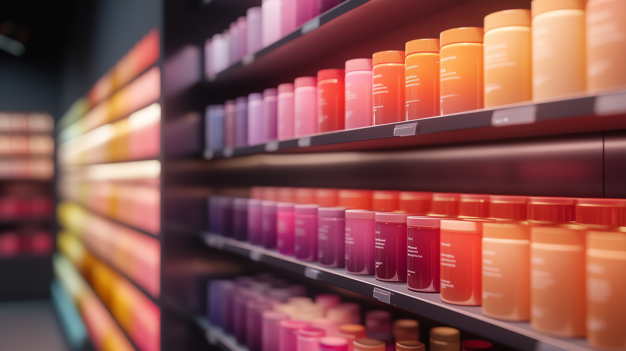
Beyond individual colors, color combinations play a decisive role. Strong contrasts, such as black and yellow, immediately draw attention, while soft harmonies with pastel or analogous shades create a soothing atmosphere. The choice of colors should align not only with the brand’s values but also with the purpose of the space: to encourage impulse purchases, extend visit duration, or strengthen customer loyalty.
Color is more than just a decorative element; it directly influences how customers interact with a space. In commercial design, it is used strategically at multiple levels to create a coherent and engaging customer experience.
One of the most impactful uses of color is in brand identity. A strong, well-chosen color quickly becomes a recognizable element, inseparable from the company itself. Think of Coca-Cola’s iconic red, which conveys energy and conviviality, or Apple’s minimalist white, symbolizing innovation and purity. These choices are never random—they embed the brand in consumers’ minds while eliciting specific emotions.
Colors also help structure the customer journey within a store. They can differentiate areas in a retail space, highlight promotions, or subtly guide attention to specific products. For example, a relaxation area may feature soothing blues and greens, while a promotional zone could use red or yellow to encourage impulse buying. These choices influence not only visual perception but also consumer behavior. Studies show that well-selected colors can increase brand recognition by 80%, demonstrating their direct impact on sales and customer loyalty.
Lastly, the overall ambiance of a space relies heavily on its color palette. Warm tones such as red and orange stimulate emotions and encourage quick decisions, making them ideal for dynamic environments. Conversely, cool shades like blue and purple extend the time customers spend in a store by fostering a calming atmosphere. Retailers must carefully consider the broader effects of their color choices—whether to invite exploration or drive sales.
To better understand the impact of color in commercial design, let’s look at a few concrete examples. In supermarkets, promotional areas are often decorated in red and yellow—colors that create a sense of urgency and immediately draw attention. These choices are particularly effective for end-cap displays, where impulse purchases are common. Conversely, organic stores favor greens and browns, which evoke nature, health, and authenticity, reinforcing their message of sustainability and well-being.
But what happens when a color strategy fails? Imagine a luxury boutique using neon orange and bright pink—colors that clash with customer expectations in the high-end sector. Such a mismatch could quickly damage the brand’s image and deter potential buyers. This example underscores the importance of understanding the target audience and market context before defining a color palette.
The numbers confirm these findings. Research has shown that well-chosen colors can increase sales by up to 15%, while a thoughtfully designed color scheme can extend the average time spent in a store by 30%. Combined with case studies from brands that have refined their color strategies, these insights illustrate the tangible impact of visual choices on commercial performance.
The world of color is constantly evolving, driven by technological advancements and shifting societal preferences. Today, augmented reality tools allow businesses to simulate the effects of color in a space before implementation, providing unprecedented precision in design. Meanwhile, predictive analysis applications measure the psychological impact of color palettes on consumers, helping brands anticipate reactions.
Current trends favor a return to natural, earthy tones, reflecting a desire for authenticity in an increasingly saturated world. Soft, reassuring pastel shades are also in demand, particularly in the post-COVID era, where comfort and security have become top priorities. Looking ahead, color preferences are expected to continue evolving, with younger generations gravitating toward bold and experimental hues.
Colors are not just decorative—they guide, influence, and transform. From brand identity to customer behavior, they are a crucial strategic asset in commercial design. Understanding color psychology and integrating it thoughtfully into retail spaces can mean the difference between an ordinary store and a truly memorable experience.
For professionals in commercial design, this is a factor not to be overlooked. By incorporating color analysis into your strategy, you can create environments that resonate with customers’ expectations and emotions. With the expertise of specialists like Mobico, you can design spaces that leave a lasting impression and drive sales.